FREELANCE CONTRACT
FLOWER SHOP WEBSITE


Overview
Flora’s Custom Flowers is a charming, little flower shop located in Atlanta, GA. With their tenacity and creativity, they make a wide range of lavish, custom flower orders and pre-designed bouquets. Flora’s Custom Flowers has a target customer base of busy individuals who needs flower for various occasions and extravagant events. This project entails the revamp of the website for the flower shop.
My Role
My Location
Responsibilities
Product Designer
Atlanta, GA
-
Research
-
Conducting interviews
-
Sketch & Wireframes (Paper & Digital)
-
Prototyping (Low & High)
-
Iterating designs
-
Accessibility
-
Usability Studies & testing
-
Content Writing
Busy individuals and groups are not inspired to do any purchases with the current design of the website.
Challenge
Solution
Updating the website to encourage new and existing users to place more orders by making a fun and modern design.

Research
Research Summary
The research gathered from the user group clarified reasons that individuals or groups could not make these purchases on their own. The recurring reason was centered around the layout of the design, not easy to understand. Another reason was that there were no photos to inspire users to make purchases, i.e. no photos of floral arrangements at events to display the work that they did.

Persona
Name: Vanessa M.
Age: 45
Education: Associates Degree
Hometown: Atlanta, GA
Family: Husband and son
Occupation: Event Planner
Vanessa is a wife and mother working full time as an event planner. She wants to make custom flower arrangements for every event so she will need to find a reliable, local flower shop to use. With her hearing impairment, it is hard for her to communicate her orders over the phone so she prefers to use the website. Vanessa needs the website to be streamlined to place an order and appealing to engage her to be inspired.
With my hearing impairment, it’s hard for me to call in my order. I want an inspiring and streamlined website to use so I don’t feel overwhelmed when placing an order.
- Vanessa
Problem Statement
Vanessa M. is an event planner, wife, and mother who needs a simple and inspiring website for her to place her custom flower arrangement order for large events. She has hearing impairments which causes her to not be able to use the phone to place an order.
Frustrations
Vanessa has some hearing loss so it’s difficult for her to speak on the phone to order items she wishes to purchase.
Goals
-
Make this place my favorite destination to get custom flower arrangements for events.
-
Be inspired by the website for the next event.
-
Feel at ease
Vanessa's Journey Map


Pain Points
Lack of Inspiration
Need help designing arrangements and be inspired by what they see as options.
Accessibility
Not all the plants and flowers are available to them due to the season.
Ease of Use
Wants the process more streamlined when placing an order.
Ideation & Prototype
Sitemap

Paper
Wireframes
Sketching the screens allowed the components to acknowledge the user pain points. I started with the mobile first design approach. Research has shown that mobile is the best source because of its accessibility for more people.

Lo-Fi
Wireframes
From the paper wireframes, I made the digital wireframes. This is to show how the design is streamlined for easy purchasing made by the customer. Through the research, and remembering user-centric design thinking, I learned that users would like to see some inspiring ideas so it can help them order a custom arrangement.


Design Phase 1
Inspirations
The client saw a few websites that inspired the idea of what she wanted the site's general design to look like. I encouraged a different path, but we compromised with the design that suited her vision. From that point, my main objectives were to be accessible and easy to navigate.

Basic UI Kit
Hi-Fi Wireframes

Prototype
Flow 1 of many options for this app.

Design (before testing)


Testing
Study Type
Moderated Usability Study
Participants
4 females, 1 non-binary, 3 males
1 female with hearing impairment, various ethnic backgrounds, Ages 18-69 years old
Location
Atlanta, GA, USA, remote
Length
25-30 minutes
Usability Findings
After doing two rounds of usability studies, the first round of usability studies provided insights for the low fidelity prototypes that needed adjustments to take out some steps to make it easier to navigate. Whereas the second round of users gave some guidance to improve the design of the mockups. I found that users want to place their orders with a simple and eye catching design flow.
Round 1
-
Wanted to see photos of previous work that would inspire the user.
-
Could not locate additions to make the order truly custom, i.e. cards or baskets.
Round 2
-
User thought the design was still lacking in modern design.
Design Phase 2
Iteration
After receiving the results of the usability tests, the client allowed me to make some changes for improvements that were best for a more modern design.
Design Improvements
Animation
Subtle movements were added to the pages to engage the users as they are moving through the screens, i.e. parallax images.
Removing Shadows
Eliminating the shadows from behind components. The drop shadows were an old style.
Decorative Components
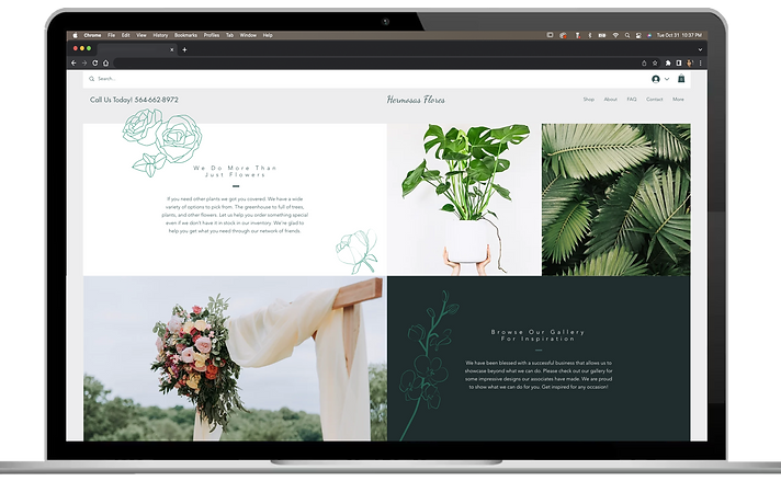
Vector art was added to some sections of the pages for visual interests to be present without crowding the page.
Better Photos
Changed the image designs so that the subject of the image has a cleaner background, and not using the full frame.


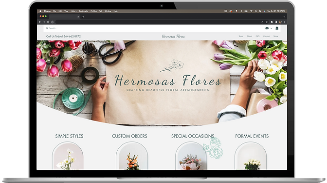
Hermosas Flores
CRAFTING BEAUTIFUL FLORAL ARRANGEMENTS


Accessibility Considerations
Alt Text
Alt text was used for pictures for those using e-readers due to vision impairments.
Colors
Accessible colors for the fonts and shapes used throughout the design.
Final Design


Conclusion
Impact
The updated website eliminated the pain points by making it easier for the user by removing unnecessary content and streamlining the process. The style update made a difference as it was more appealing to the users.
What I learned
Be patient with customers who have their own vision of how a product should be designed despite it not being my own vision. Compromise where you can, but iterate ideas that could change their minds.
Next Steps
Reach out to the client again to see if we are going to move forward with the project.
